
The more options, the better—right?
Well, not really.
Many studies have shown that having too many options makes decision making more difficult, which can lead to a decreased feeling of satisfaction once the decision is made.
This is the paradox of choice. We would think that having more choices makes it easier to find an option that best suits our wants and needs, ultimately leaving us happier with our decision. However, the exact opposite happens. Decision making becomes more difficult and we are less satisfied with what we choose.
Translation: When presented with too many options, customers are less likely to buy. And if they end up buying, they are less satisfied with their purchase.
We don’t want our customers to experience this dilemma. So what can we do?

The paradox of choice in eCommerce
The first study that brought the paradox of choice to light was conducted by psychologists Sheena Iyengar and Mark Lepper in 2000. Customers at a high-end food market were presented with a display of 24 gourmet jams on one day, and with only 6 on another. It turned out that those who saw the bigger display were 10% less likely to buy than those who saw the smaller one.
Many other studies have shown similar results. As the variety of products offered in a store increases, sales and customer satisfaction decrease.
Now these studies were conducted in physical stores where customers had the advantage of holding the products in their hands, seeing them up close, and in case of food, even tasting them. And the customers still had difficulty making a choice or ended up not buying at all.
Just imagine how much more challenging it is to get the customers to actually make a choice and complete a purchase in a virtual store. When shopping online, customers rely mostly on product photos, descriptions, and reviews. And making them scroll through an endless list of very similar looking products, with limited descriptions and no reviews, clearly doesn’t help.
How to avoid the paradox of choice in eCommerce
Here’s a rundown of the things you can do to save your customers from the paradox of choice when shopping in your online store.
1. Product badges
A simple and easy way to highlight some of the products on a product list page is adding product badges. The badges can say anything from “Best Seller” and “Popular Choice” to “Best Price.” They allow the products to resonate more with the shoppers’ idea of a good product, potentially helping the shopper arrive at a decision faster.
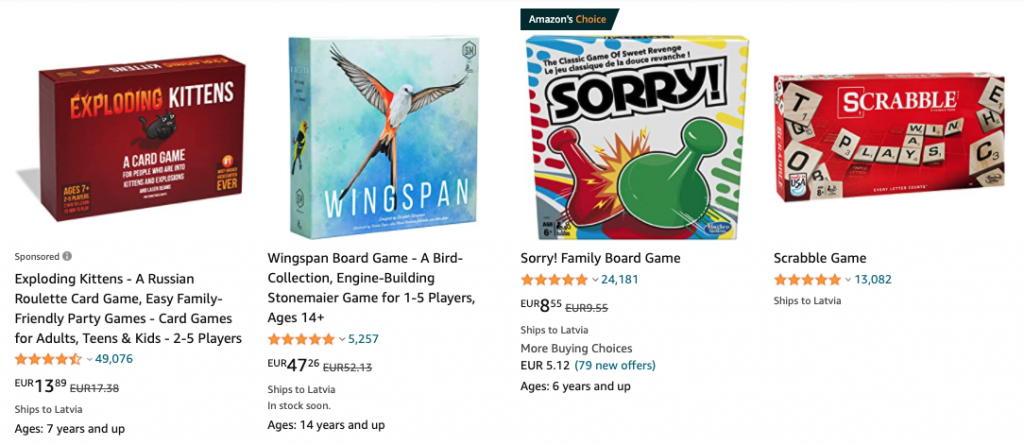
“Amazon’s Choice” (Amazon)
2. Best selling products
Another technique is highlighting top selling products. Online stores usually do this on the homepage, so new users can immediately spot the most popular products and go straight to their product pages.
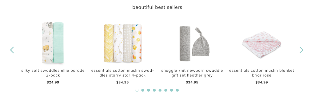
“Beautiful Best Sellers” (Aden & Anais)
3. Detailed filtering
If the products being sold have a lot of specific features and offer multiple customer benefits, a good strategy is to make a very detailed product filter available. It saves the users from having to scroll through endless product list pages of similar products. With the filter, customers can quickly select all the features that they want and see only relevant products.
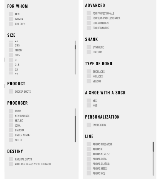
Detailed Product Filter (R-gol.com)
4. Products comparison
If the products are technical and with a lot of attributes, a good way to differentiate them is to display a comparison table. This gives the customer a quick view of the features and specs of different models and helps them find the best option faster.
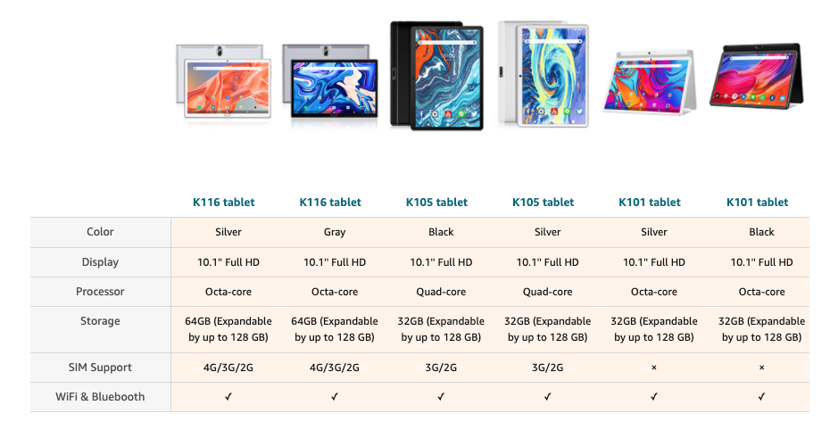
Comparison Chart (Amazon)
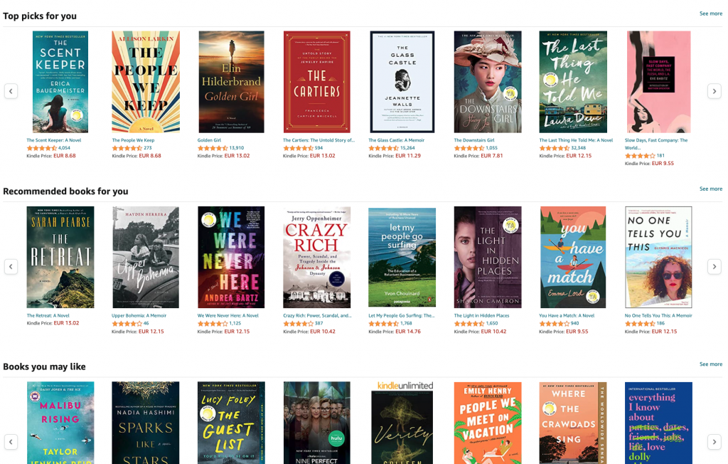
5. Personalization
A very successful technique for keeping the shopper from being confronted with the paradox of choice is personalizing the experience for them. A quite simple way to do this is to display product recommendations based on their browsing history.
“Top Picks for You” (Amazon)
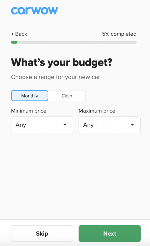
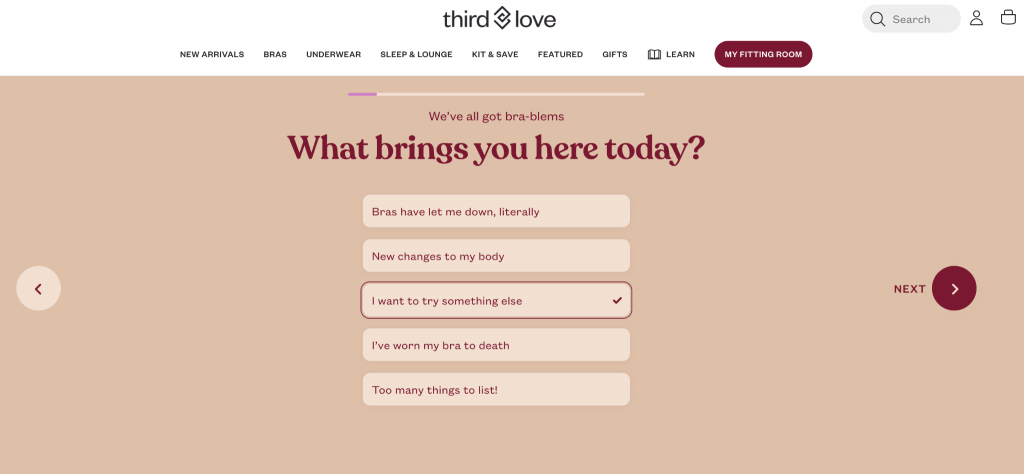
Meanwhile, a more creative approach is encouraging the users to take a survey, asking them questions about their needs and preferences and then displaying relevant products based on their answers.
Carwow.co.uk – If users are unsure about what type of car they want or would be right for them, they can take a “test” on the website and see personalized recommendations based on their responses.
Thirdlove.com – Users can take a very detailed survey to make sure they choose the right product size as well as the best fit and style.
If you liked this post and would like to know more about other eCommerce strategies you can apply to your business, shoot us an email at [email protected] and we’ll be happy to tell you more. Our Growth Team can help you match your goals with the best strategies that are proven to work.

Share on: