Your email sign-up form is the cheapest growth lever you own. It runs on traffic you already paid for, and every subscriber it captures becomes someone you can reach again for free. Yet most stores treat it as an afterthought, presenting it as a generic “subscribe to our newsletter” box that converts a fraction of what it could, while the traffic keeps getting more expensive.
Our guide covers the essentials for sign-up form conversion, including how short to make it, what to offer, where to place it, how to handle opt-in, and the benchmarks to measure it against, so more of your existing visitors become subscribers.
Overview
- A sign-up form’s conversion depends on a few things you control: field count, the incentive, placement, and timing.
- Average email opt-in forms convert at around 2-3%, so a form well below that is leaving subscribers and revenue on the table.
- The list you build is only as valuable as the email program behind it, so sign-up forms and email strategy are one system.
🚀 Quick takeaway
Treat the sign-up form as a conversion surface. Cut the fields, give a real reason to subscribe, place it where intent is high, and measure it against a benchmark. Small changes here compound, because the form works on traffic you already have.
What makes a sign-up form convert?
A sign-up form converts when the value of subscribing clearly outweighs the effort of filling it in. Everything below is a way to tilt that balance: reduce the effort (fewer fields, easy design), and raise the value (a real incentive, the right moment).
Across large datasets, email opt-in forms average roughly 2-3% conversion, and strong ones clear well above that. Klaviyo suggests aiming for a form submit rate of at least 3%. If yours is at half a percent, the problem is almost always too much effort for too little perceived value.
Keep the form short
Every field you ask for costs conversions. For an email sign-up, you usually only need the email address. Name, preferences, and demographics can come later, once the relationship exists.
Reducing fields increases completion, and one well-known case found that cutting a form from 11 fields to 4 raised conversions by around 120%. When you genuinely need more information, a multi-step form that asks one thing per step tends to outperform a single long form, because each step feels small. The principle holds either way: ask for the minimum required to start the relationship.
Give people a reason to sign up
“Subscribe to our newsletter” is not a reason. A discount, free shipping, early access, or a genuinely useful resource is. Incentivized forms consistently outperform plain ones. Discount popups have been measured to convert meaningfully higher than no-offer popups, and gamified “spin to win” forms even higher. Incentives built on scarcity, such as limited-time or limited-stock offers, can further encourage response.
The incentive also sets up the relationship. A first-order discount invites a purchase, and useful content invites engagement. Match the offer to what you want the subscriber to do next, and make the value the headline of the form.
🚀 Quick takeaway
The offer is the form. A discount, free shipping, or a useful resource converts far better than “subscribe to our newsletter.” Lead with the value and match it to what you want the subscriber to do next.
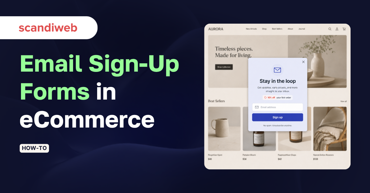
Design and placement
A form converts where attention and intent are highest, in the right format for the moment:
- Popups and flyouts catch attention and convert well when timed right, but a popup that fires instantly on arrival interrupts before any intent exists; trigger on scroll depth, time on page, or exit intent instead
- Exit-intent popups catch the visitor who is about to leave anyway, and consistently post some of the highest opt-in rates because they cost nothing in interruption
- Inline and embedded forms convert lower than popups on their own, but work as an always-available option on high-intent pages
- Landing pages convert the highest of all placements, because the whole page is the offer.
Keep the design clean and on-brand, make the field and button large enough to use on a phone, and write a button label that states the value (“Get 10% off”) rather than the mechanic (“Submit”).
🚀 Quick takeaway
Do not fire a popup the second someone lands. Trigger on scroll, time, or exit intent, lead with the incentive, and keep it one field and one button. The timing and the offer generate conversion more than the visual design does.
Single vs double opt-in
A double opt-in asks the subscriber to confirm via a follow-up email before they join the list. It adds one step, which costs a little upfront conversion, but it produces a cleaner, more engaged list and protects your sender reputation, which matters for the deliverability of every email after.
On compliance: GDPR does not explicitly require double opt-in, but it does require consent that is unambiguous, specific, informed, and freely given. Double opt-in is the simplest way to prove consent and is effectively expected in some markets. For most eCommerce lists, the cleaner list and better deliverability make double opt-in worth the small conversion cost.
🚀 Quick takeaway
Double opt-in costs a little upfront conversion and pays it back in deliverability. A clean, confirmed list lands in more inboxes, so every email after the sign-up performs better.
Test and measure your forms
Sign-up forms are among the easiest things in a store to test, because the traffic and the outcome are both high-volume. Run one change at a time, form length, incentive, trigger, copy, and measure submit rate against the 2-3% benchmark, then keep what wins. This is ordinary conversion rate optimization applied to the top of the funnel, and tying form data into your eCommerce analytics also shows which sources and offers produce subscribers who actually buy.
🚀 Quick takeaway
Measure submit rate and test one variable at a time. A form is the rare experiment where you get fast, high-volume feedback, so there is no excuse for running the same underperforming box for years.
How scandiweb approaches sign-up forms
scandiweb has delivered over 2,100 eCommerce projects since 2003, and the sign-up form is one of the first places we look when a store wants more from its existing traffic. Get the form converting, then make sure the email marketing behind it turns those subscribers into buyers. A form that captures emails a program never uses well is only half the job. Also read: our guide on email marketing best practices on what to do with the list once the form is filled out.
Frequently asked questions
What is a good conversion rate for an email sign-up form?
Across large datasets, email opt-in forms average roughly 2-3%. Klaviyo suggests aiming for a submit rate of at least 3%. Exit-intent and well-incentivized popups can run higher, while a form well below 2% usually signals too many fields or too weak an incentive.
How many fields should a sign-up form have?
As few as possible, usually just the email address. Every extra field lowers completion, and one well-known case found cutting a form from eleven fields to four raised conversions by about 120%. Collect additional details later, once the subscriber relationship exists, or use a multi-step form that asks one thing per step.
Should I use single or double opt-in?
For most eCommerce lists, double opt-in is worth the small upfront conversion cost. It produces a cleaner, more engaged list and protects sender reputation and deliverability. GDPR does not explicitly require it, but it is the simplest way to prove the unambiguous, informed consent the regulation does require.
Are popups or inline forms better for sign-ups?
Popups, especially exit-intent and well-timed scroll or time-triggered ones, generally convert higher than inline forms, while landing pages convert highest of all. Inline forms work best as an always-available option on high-intent pages. Avoid popups that fire instantly on arrival, before any intent exists.
What should an email sign-up form include?
At minimum, an email field, a clear value-led headline (the incentive), and a button that states the benefit rather than “Submit.” Keep it to one field where possible, make it usable on mobile, and include the consent language your market requires. Everything else is optional and usually costs conversions.
Is your sign-up form converting as well as it could? Audit your sign-up forms with us and we will test the fields, offer, and timing against benchmark, then connect the list to an email program that turns subscribers into buyers.

Share on: